Kyte
Investment bank
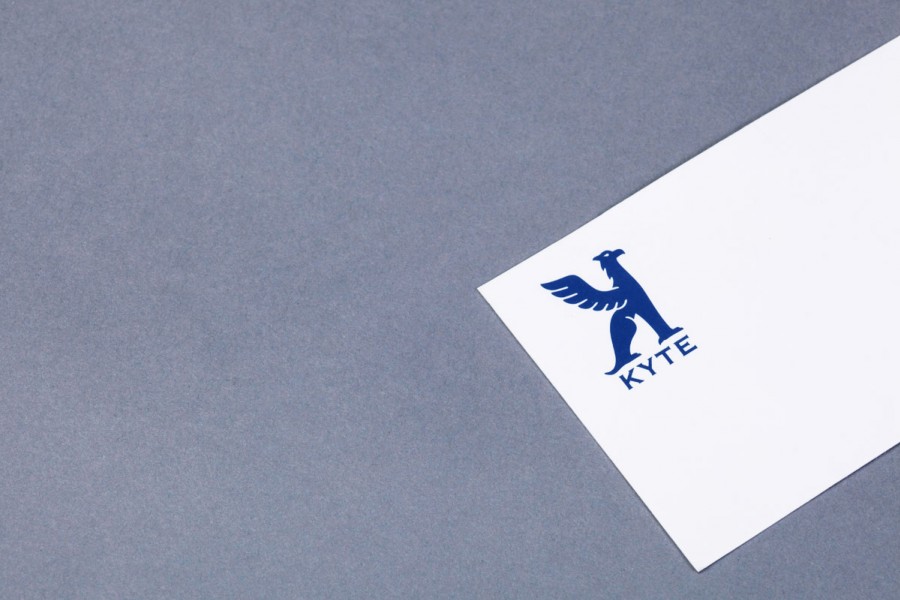
For this highly target-orientated logo, the choice of a griffon was essential: in addition to taking the form of the letter K written backwards (the company’s initial), the charismatic creature provides an aura of authority and an elegant stature which, together
with its blue colour, conspire to reassure clients.
- Creation of the logo
- Design and creation of the brand’s visual identity
- Creation of stationery + templates